Book Covers!
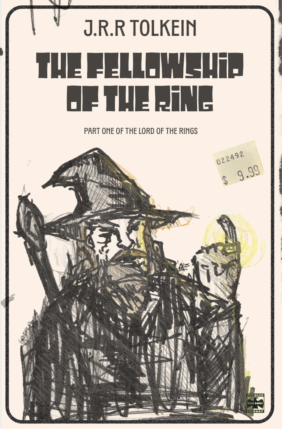
Handmade Design - For this cover, I wanted the illustration to feel handmade and a little rough, almost like a quick sketch someone might do while reading the book. I started by drawing Gandalf using a regular ballpoint pen, keeping the lines loose and sketchy so the drawing would have energy and movement. After the initial outline, I went back in with Sharpie to darken the main shapes and add bolder strokes for his beard, cloak, and hat.
To bring in a little warmth, I used colored pencils, adding soft yellow around the ring and some subtle shading throughout the drawing. I let the pencil marks stay visible because I wanted the texture to feel natural and unpolished.
Once the drawing was finished, I placed it on a simple, neutral cover layout so the illustration stayed the main focus. The type is clean and bold to contrast with the messy lines, and the old price sticker gives it a vintage, thrifted feel. The final design mixes simple materials with an intentionally rough, handmade style.
Typography Design -
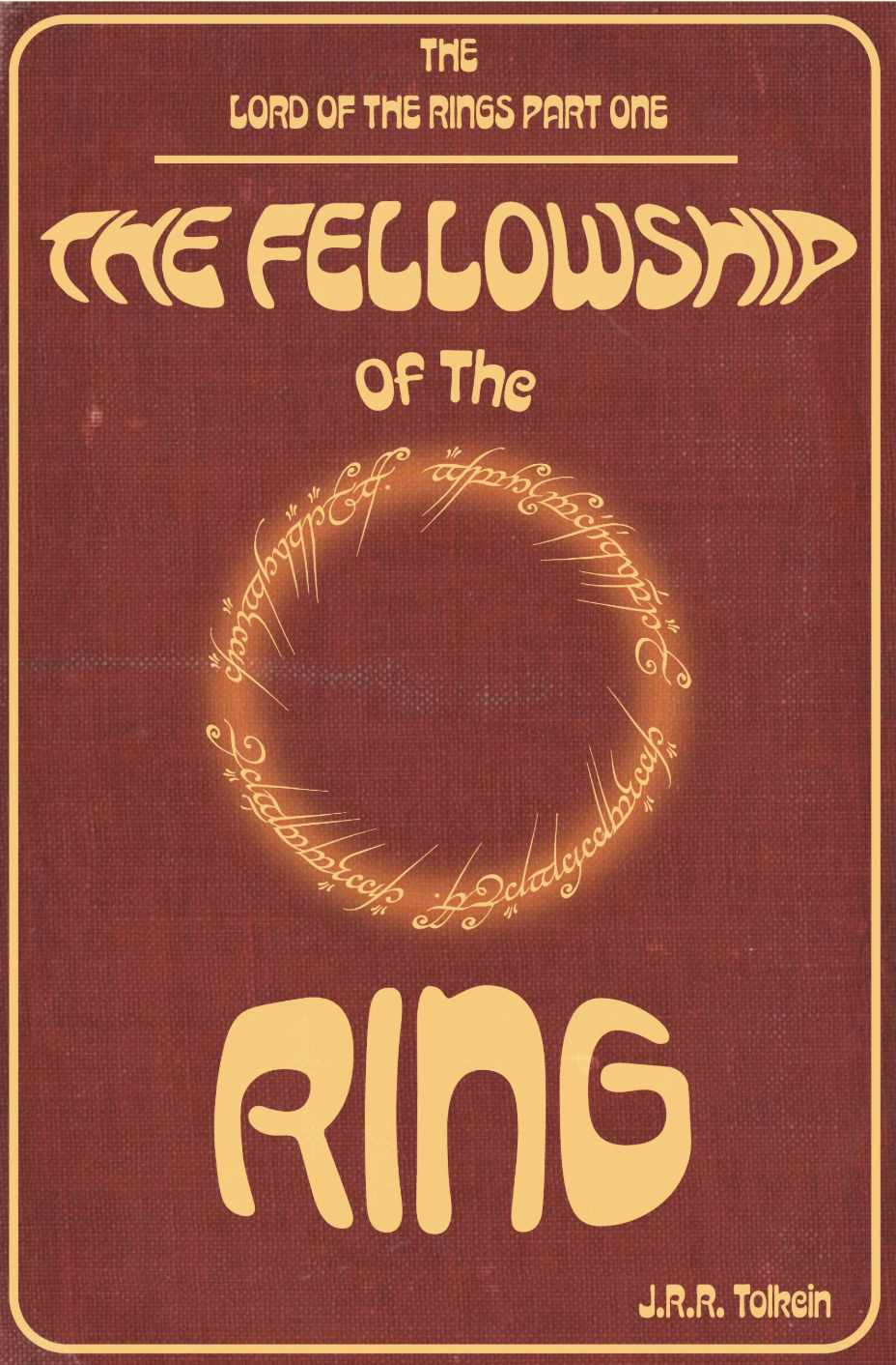
For the typography version of this cover, I focused on creating a strong visual identity using type alone. I started by experimenting with different letterforms for the title, looking for something bold enough to feel adventurous but still readable. I played with scale, spacing, and weight until the title had a clear hierarchy and felt balanced on the page.
I used clean, structured type to contrast with the handmade look of my other covers. I arranged the text in a way that guides the eye from the title to the author and then down through the smaller details. I kept the layout simple so the typography could carry all of the visual interest on its own. The final design relies on rhythm, alignment, and spacing to create a modern but timeless look that still fits the tone of The Fellowship of the Ring.
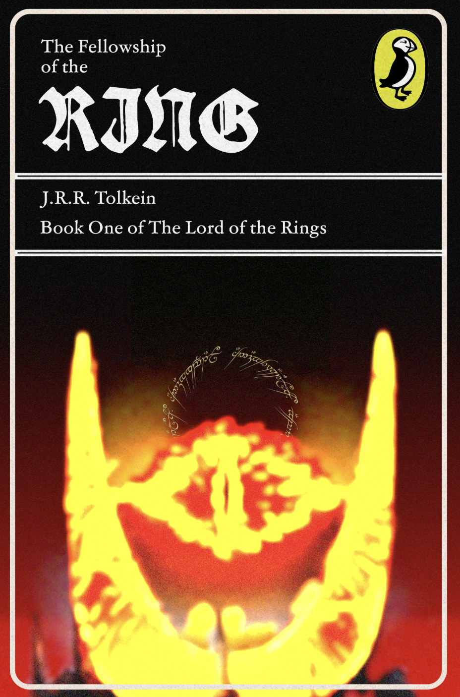
Designers Choice-
Working digitally let me refine the shapes more precisely and play with layering, transparency, and subtle texture. I kept the palette muted so the design felt classic rather than overly modern. Once the composition was set, I adjusted spacing, alignment, and contrast to create a clear sense of hierarchy. The final result is a design that feels clean and intentional, with a smoother and more refined look compared to the handmade and typography versions.